Tutorial: Tilted code card
6 min read. Learn about syntax highlighting, font smoothing, and gradient overlays.
Welcome! This is a post in my Dev series, where I attempt to explain and recreate interesting front-end dev techiniques I run across on the web.
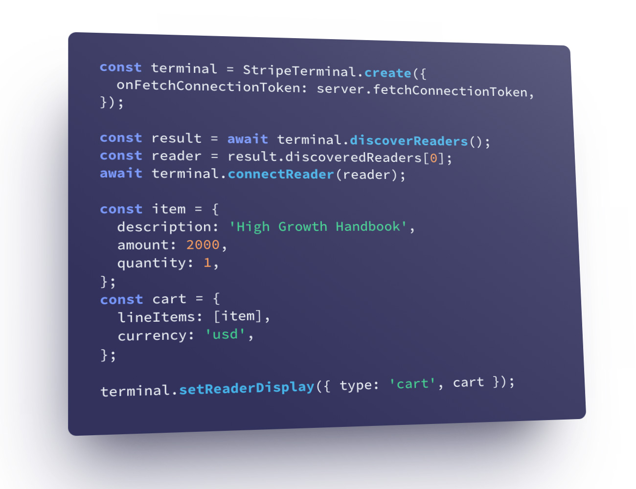
In this post, we'll recreate the tilted code card (see image above) from the Stripe Terminal page.
Our strategy for this will be to work on the inner components and then move outwards. Let's work on getting the code snippet styled.
Part 1: Styling the code snippet
Picking a syntax highlighting library
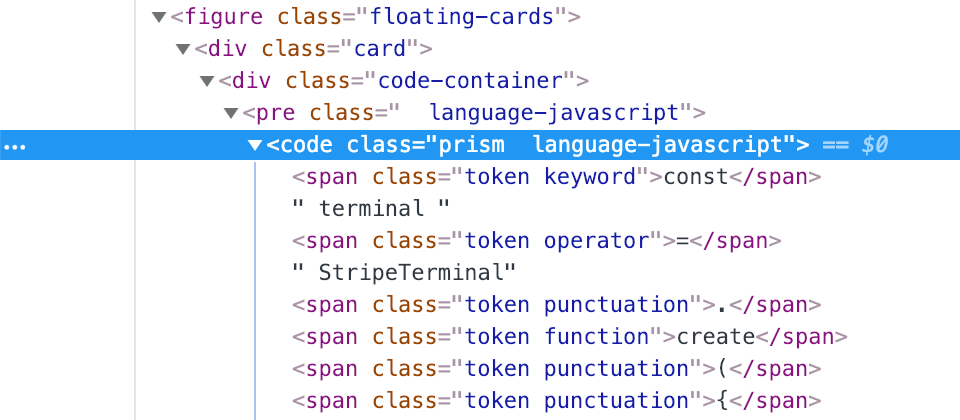
Let's figure out how we want to apply syntax highlighting. We could manually insert DOM elements in to the code snippet to use as styling hooks, but this would be tedious to set up and a pain to maintain. Fortunately, there are many syntax highlighting libraries available. If we peek at the DOM on the Stripe page, we can see a class called prism:
Google for "prism syntax highlighting" and bingo: PrismJS. Spend five minutes to play around with the examples, read the basic usage instructions, check the Readme on Github for any warnings, and see if the project is actively being maintained. In this case, no red flags, let's go!
Adding Prism for syntax highlighting
Download and load prism.js and include the CSS for one of their themes. I picked the Tomorrow Night Prism theme as a starting point.
Add two classes to the code tag: <code class="prism language-javascript"> and this is what we get:
See the Pen Stripe - Code Card 1.1 - Add Prism by Lokesh Dhakar (@lokesh) on CodePen.
Updating the font stack
Let's get our fonts aligned before digging into the colors. The code snippet uses the following font-stack: Source Code Pro, Consolas, Menlo, monospace.
Source Code Pro is an open source font made available by Adobe. Stripe is hosting it themselves, but we'll load it from Google Fonts and pull in the Medium and Bold weights. We've specified monospace fallbacks just in case there is a problem loading the font, Consolas for Windows and Menlo for MacOS.
In this step, we also went ahead and updated the font-size and line-height to match.
See the Pen Stripe - Code Card 1.2 - Font update by Lokesh Dhakar (@lokesh) on CodePen.
Finessing the font weights
There are two font weight tweaks we need to make:
Use a heavier weight for keywords and functions in the code snippet.
This design decision seems to be less about highlighting certain elements of the code because they have elevated importance, but rather to introduce some dynamism to the visuals. This works great in this scenario, but you might reconsider this styling if you needed to show a large number of code samples.
Update font-smoothing rules. This will make the fonts render a little thinner and crisper, especially light text on dark backgrounds.
-webkit-font-smoothing: antialiased;
-moz-osx-font-smoothing: grayscale;
text-rendering: optimizeLegibility;
Font-smoothing adjustments were originally intended to resolve device specific rendering issues. Fix the blurry bits, with a small performance trade-off. But now days they are used as a way to finesse type rendering for aesthetics, similar to Photoshops's sharp, crisp, strong, & smooth options.
See the Pen Stripe - Code Card 1.3 - Font weights by Lokesh Dhakar (@lokesh) on CodePen.
Update the colors
We can use dev tools to inspect the color values used by Stripe and move them into our Prism theme CSS.
See the Pen Stripe - Code Card 1.4 - Color updates by Lokesh Dhakar (@lokesh) on CodePen.
End of part 1
Stripe on the left, our version on the right.
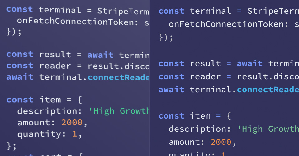
We used the same hex values as Stripe, but our version is rendering differently. We'll come back to this in the next part...
Part 2: Styling the card
Create the card element
Add a wrapper element around our code snippet to use as our card. We'll give it padding, a width, our purple background, and a border radius.
See the Pen Stripe - Code Card 2 - Card wrapper by Lokesh Dhakar (@lokesh) on CodePen.
Adding a shine
Remember those mismatching colors from the end of part 1? By inspecting the DOM we find that there is a translucent overlay on top of the card. It's a div with a subtle gradient that fades from white to transparent, starting from the top right. This is what makes the text colors a bit more subdued and also provides us that nice shine to the card.
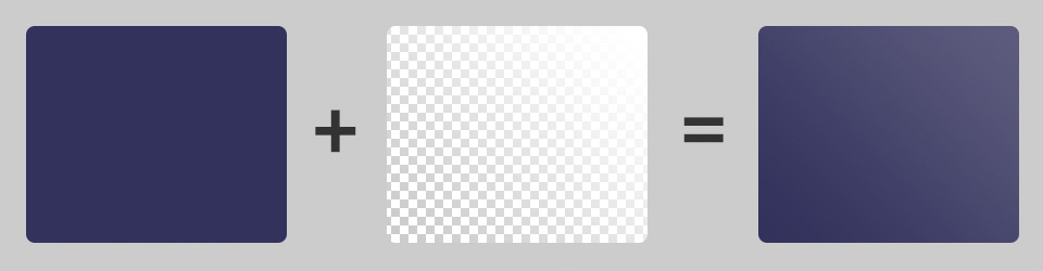
Add a block element for the shine.
<div class="card">
  <div class="card-shine"></div>
  <div class="code-snippet">
    ...
  </div>
</div>
Stretch the element to edges. There are multiple ways to have an element stretch to fit the width and height of its parent. We'll use an absolute positioning technique in which we set all of the directional values to
0. Make sure to set the parent element toposition: relative..card { position: relative; } .card-shine { position: absolute; top: 0; right: 0; bottom: 0; left: 0; }
Add gradient and set opacity. Our shine element should now be sized and in position. Let's add the shine effect with a gradient.
.card-shine {
  background: linear-gradient(
    to top right,
    rgba(255, 255, 255, 0),
    rgba(255, 255, 255, 0) 20%,
    rgba(255, 255, 255, 0.5) 70%,
    #fff
  );
  opacity: 0.2;
}
Keep content below the overlay interactive. Set
pointer-events: noneon the card shine overlay to make sure it doesn't block clicks and taps from getting through.
See the Pen Stripe - Code Card 2.1 - Add shine by Lokesh Dhakar (@lokesh) on CodePen.
Make it pop off the page
We're going to rush through this section and save the more in-depth discussion on box-shadows and 3d transforms for a follow-up post.
Add shadows.
.card {
 box-shadow:
   -27.1px 62.5px 125px -25px rgba(50, 50, 93, 0.5),
   -16.2px 37.5px 75px -37.5px rgba(0, 0, 0, 0.6);
}
Tilt in 3d. Enable 3d space by adding a parent element with
perspective: 1500px. Then add a transform to the card:.card { transform: rotate3d(0.5, 0.866, 0, 15deg) rotate(-1deg); }
🏁 Tilted code card
See the Pen Stripe - Code Card 2.3 - Add shadows and tilt by Lokesh Dhakar (@lokesh) on CodePen.
I hope you enjoyed this post and learned something new. If you did enjoy it, check out the full listing of posts for more from the Dev series.
And send me your thoughts while they are fresh in your mind. What parts did you like? What parts were confusing? What would you like to learn about next?
And lastly, follow me on Twitter to find out when the next post is up.